Back in January at the 2019 T3 Advisor Conference, we gave a first look at two exciting projects Advicent has been hard at work on — NaviPlan’s visual design update and a new retirement planning experience. As promised, the visual design update has arrived with the recent release of NaviPlan 19.0. If you have not yet seen the new design update, check it out here. We can’t wait for you to take a look.
As manager of user experience and design at Advicent, I have the pleasure of leading the talented, enthusiastic group of individuals tasked with designing NaviPlan. In the user experience (UX) discipline, refreshing the design of a B2B software application — especially one with a long tenure and remarkably deep functionality — is one of the toughest tasks you can take on. This challenge drives us, and we are just getting started on the journey of transforming NaviPlan.
In this post, I want to offer a designer’s perspective of the NaviPlan 19.0 visual design update and shed some light on what visual design is, why it matters, and some of the biggest benefits that you will see in NaviPlan 19.0 as a result.
What is visual design?
Visual design refers primarily to the aesthetic elements that you most readily notice when looking at an app, website, or digital interface. This includes all the various colors, typography (fonts), icons, and illustrations that combine to create components that advisors rely on to create financial plans such as buttons, text input fields, and navigation menus.
Additionally, visual design includes the layout of these components on a page and how they communicate information to the user while making make the planning process more efficient and user-friendly.
Why visual design matters
You spend countless hours throughout your life looking at software, so it goes without saying that it should look good. I have yet to meet someone who does not appreciate aesthetics at some level even if it happens subconsciously. In fact, there is some fascinating science that supports the importance of visual design and its impact on users.
When things are aesthetically pleasing, not only do we enjoy looking at them, but we actually find them to be easier to use. This is referred to as the aesthetic-usability effect. Researchers at Hitachi found this in 1995 through a study of ATM interfaces. They had 252 participants attempt to evaluate 26 unique ATM interfaces based on ease of use (usability) and aesthetic appeal. In the end, they found that participants tended to rate more aesthetically appealing interfaces as being easier to use, even if that was not the case.
What does this mean? Aesthetics really do matter and perception becomes reality. When we like the way something looks, it elicits a visceral reaction that sticks, leaving us with a more positive experience.
Specific to NaviPlan 19.0, we have already started getting feedback that confirms this. Here are some of what we have already heard since the release:
- Load times feel faster
- It’s “super easy to jump around”
- It “seems to flow faster as you’re entering data”
- Things just seem generally “smoother”
As for myself, I’m 100 percent in the same boat as these users. Even though I am well aware of the aesthetic-usability effect and have been testing the new NaviPlan for some time, I continue to feel more confident, efficient, and delighted with the planning process in NaviPlan 19.0.
Biggest benefits in NaviPlan 19.0
The NaviPlan visual update is not just all cognitive smoke and mirrors buried deep in our brain’s subconscious processing. Beyond enhancing the aesthetic appeal, we have made tangible improvements to both usability and accessibility in the new design.
You may have seen some of these mentioned in John Heinen’s product update post, but I’ll expand on a few key highlights.
-
Optimized screen use
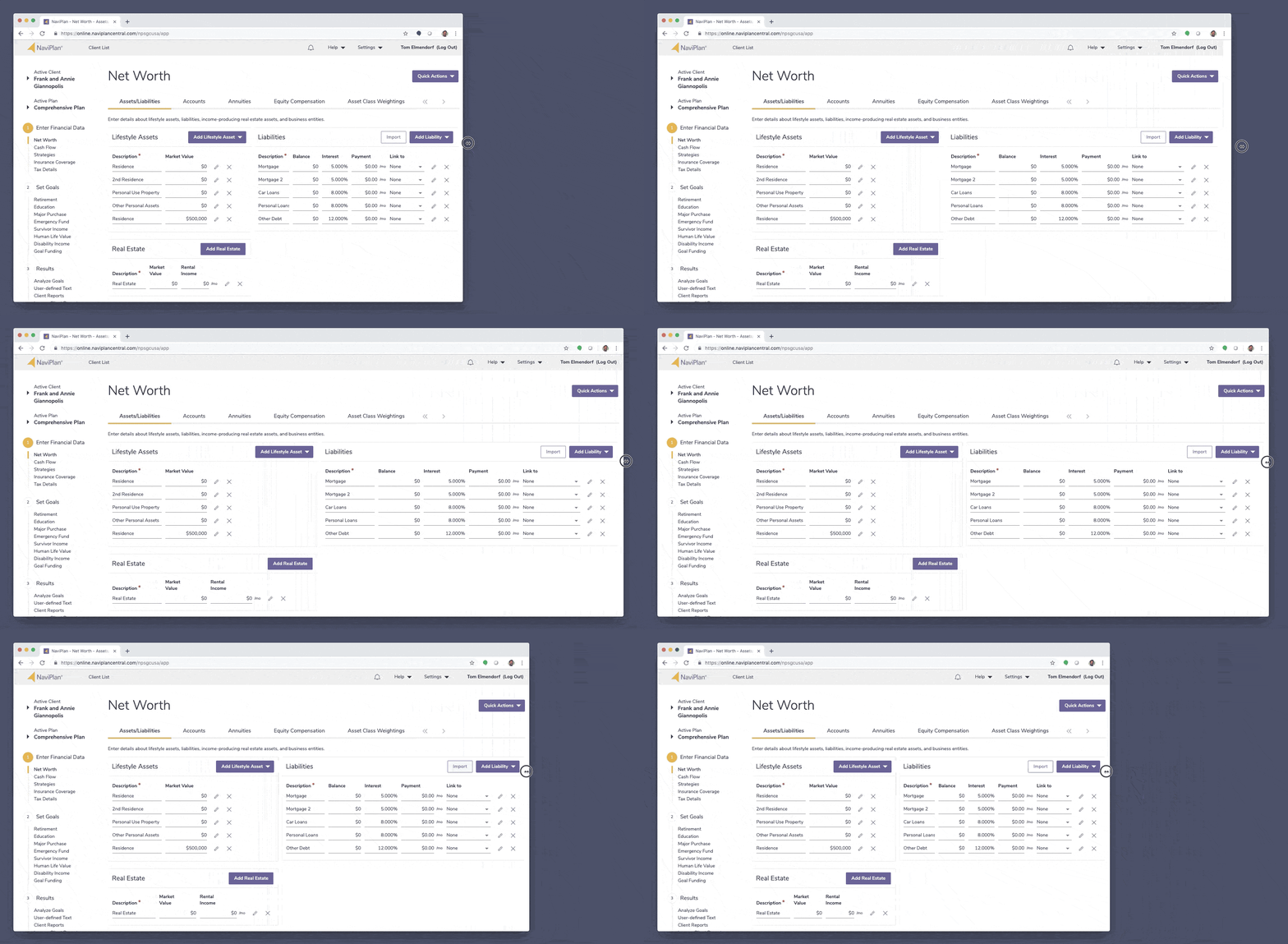
Device screen technology changes quickly and can vary widely. Since the last major visual design update to NaviPlan, laptop and desktop screen sizes have grown and become more pixel-dense, meaning there is a lot of extra screen real estate available. We capitalized on this by allowing the interface to expand to full-width, taking advantage of large desktop monitors and high-resolution laptop displays.

-
Removed distractions
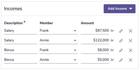
NaviPlan is a powerful application with many capabilities. With that comes the danger of overwhelming new users with just how much the application can accomplish. It was critical in this redesign to remove distractions and unneeded clutter to give greater ease of use to the application. This was accomplished through a clean, minimal design language that strips back unhelpful decoration in data-heavy areas.

-
Clarified hierarchy and importance
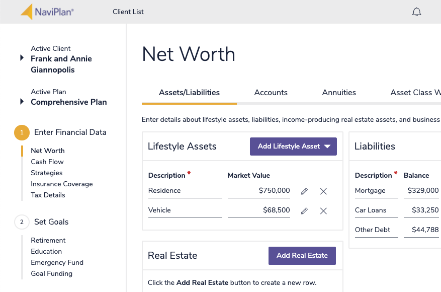
In the new design, you will see a much wider array of font sizes used, and more whitespace around them to help create a clear hierarchy within the page. Additionally, there is consistent use of gold and purple colors to emphasize structure.
Gold will always be used to highlight elements that help you understand where you are. This is found in top and side navigation bars as well as on the tabs within a given page.
Purple is used to guide you to different action elements, such as buttons and checkboxes. The more vibrant the element, the more likely that it is something useful to the task at hand.
The purpose of these colors is to enable a smooth, intuitive flow through the application. Without having to think about it, you will begin to instinctively know:
• Where am I?
• What can I do?
• What should I consider doing next?

-
Design for accessibility
Beyond being the right thing to do, accessibility – providing access to everyone, regardless of disability type or impairment – can present a great opportunity for all users. As a colleague once reminded me, the directions list in Google Maps was a feature first created to satisfy accessibility but is now recognized as a core feature for all users.
We prioritized accessibility in the design process when defining NaviPlan’s new visual design. This manifested in the application through increased font sizes and enhanced color contrast throughout.
We are just getting started
The visual design update featured in NaviPlan 19.0 represents a dramatic step forward, but this is truly just the start of what is to come.
If you are interested in getting an early look at upcoming features and are willing to take time out of your day to give honest feedback, I would love to add you to our user research contact list. Send me an email for more information.
It is an exciting time to be a NaviPlan user and we cannot wait to continue improving your experience.
Stay up to date on future NaviPlan releases by following us on Twitter and LinkedIn.